coleman
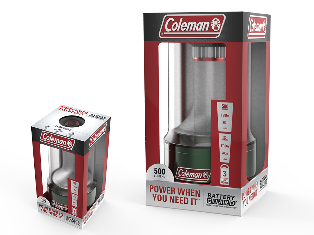
Taking on the challenge of revamping the Coleman lighting category was a lot of pressure, especially since Coleman all started with the lantern.
We introduced a larger logo, for bigger brand presence, and owning the red from it’s logo.
Starting with the multi-panel lantern, we were then able to translate the color scheme to other products within the lighting category.
Later down the line, a complimentary color was added to the packaging scheme so the consumer could easily tell there was an added feature to the product.


